How to make a full-window-width block inside a block of arbitrary width
While rebuilding the blog I wanted to be able to barge into the middle of a post with some block spanning the full width of the window. Like this:

The width of the main content column is completely arbitrary and may change depending on the window size, the browser’s mood and the phase of the moon. The only thing we know about it for sure is that it’s centered:

The most obvious way is to interrupt the content block, put in a block without margins, then continue the content:

The problem is that posts are convenient to write in markdown, and in markdown this approach turns into a hellish mess that’s hard to keep track of:
<div class="text-content">

# Post!

Blah blah blah-blah blah. Blah blah? Blah blah-blah...

...blah blahblah:

</div>

<div class="fullwidth">
    <!-- some demo -->
</div>

<div class="text-content">

Blah blaaah blah blah-blah...

<!-- ...one eternity later -->

</div>
What I want is this:
# Post!

Blah blah blah-blah blah. Blah blah? Blah blah-blah...

...blah blahblah:

<div class="fullwidth">
    <!-- some demo -->
</div>

Blah blaaah blah blah-blah...
Okay, we put the block into the content and give it width: 100vw:
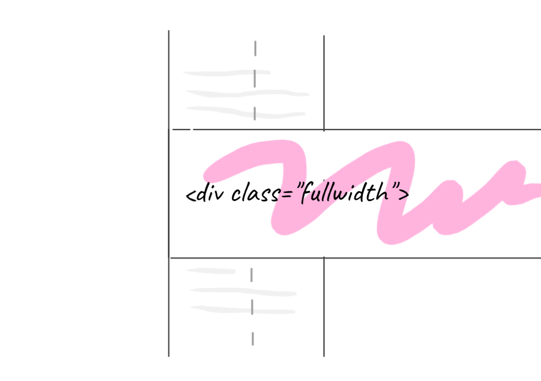
Now it has to be shifted to the left edge of the window. The distance is unknown, but we do have the width of the content block (100%) and the width of the window (100vw). First we push the block to the right with margin-left: 50%:
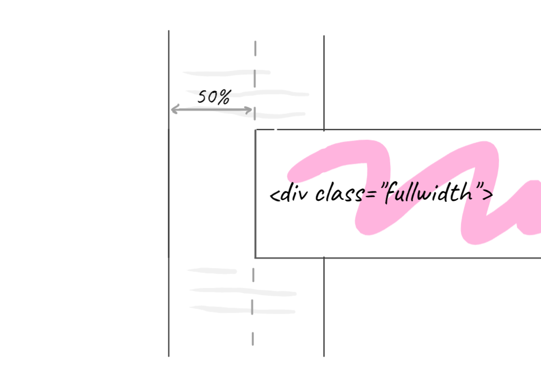
Now the block starts right at the middle of the window. Subtract 50vw so the block goes off to the left edge. That gives margin-left: calc(50% - 50vw), and the block lands where it should:
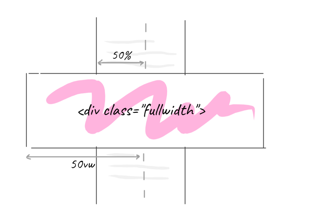
The block’s style looks like this:
.fullwidth {
    width: 100vw;
    margin-left: calc(50% - 50vw);
}
Neat, just what we need.
...or is it? What the hell is that?
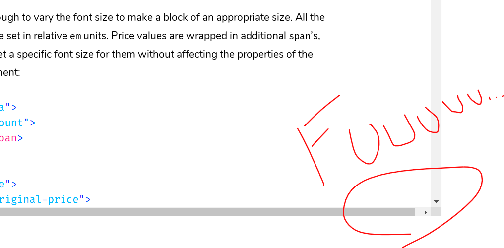
A horizontal scrollbar, where the hell did it come from?
Turns out the width of the vertical scrollbar is included in the viewport width, so 100vw is more than we need, hence the horizontal scroll. I have no idea why it was made this way, I can’t think of a single case where it would be useful.
So we need a unit that measures the window without the scrollbar. There is one: container query units. Declare body a size container:
body {
    container-type: inline-size;
}
Now 100cqw is the width of body, that is exactly the window width without the scrollbar. Swap vw for cqw, and that’s it:
.fullwidth {
    width: 100cqw;
    margin-left: calc(50% - 50cqw);
}
No scripts, no variables. This very blog is built that way.
P.S. Scrollbars on the Mac
If you do your layout on a Mac, I recommend turning on “always show scrollbars” in the system settings: problems with horizontal (and sometimes vertical) scroll become visible right away.
The vast majority of your users are on Windows, where scrollbars are always visible. Be a bit closer to them.