Deprecated! This post contains irrelevant old crap and is left for history and lulz.
Everything is good about Steam, except for its website. All the great ideas Valve guys come up with recieve a pretty poor frontend implementation.
It’s time to make our own Steam, with blackjack and hookers. I picked up a game page for mockeries and remade it. It’s not a full remake, I omitted Steam’s header and footer, I also skipped some of the elements present on the original page. Also worth mentioning that it’s more of a tech remake, design is not my forte.
And now on the problems current Steam website has and how I tried to fix them:
Problem Incomplete mobile version
Steam’s mobile website doesn’t recognize a lot of mobile devices and doesn’t have half the functions desktop version provides. For instance, it doesn’t have recently added user reviews in any shape or form.
Meanwhile, limiting the functionality of your mobile website is a really bad practice. Mobile users should be able to use all the functions available in "full" version. Both versions should be "full" versions, actually. There’s a pretty good read on the theme.
Solution Responsive design
Responsive design increases the time and complexity of the development, but, on the bright side, it allowes the whole functionality of the site to be available on any device and removes the need to maintain both versions and bother about adding new features to both of them. You still can use a combined approach in particularly difficult situations: generate part of the page on the server differently depending on the device, e. g. serve different picture sizes to different devices, or even substitute some of the templates with more simple or complex ones.
My demo uses mobile first approach, i. e. base styles for small screens, media queries for larger ones.
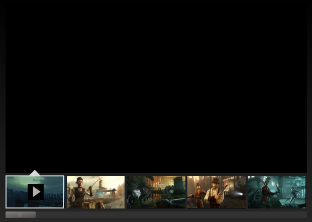
Making the gallery responsive
Responsive screenshot gallery should work on any device, with any type of touch events. I used my Peppermint touch slider for this purpose. I also made a scroller for the thumbnails based on the event unifying code from Peppermint (which I detached into a separate script, by the way). Now you can drag both the screenshots and the thumbs using mouse or touch:
Thumbnails are replaced with dots on smaller screens (you can see the dots by shrinking the browser window).
Everything combined and wrapped in a jQuery extension:
$.fn.steamGallery=function(){$(this).each(function(){var body =$('body'),
slidesBlock =$(this).find('.slides'),
thumbsBlock =$(this).find('.thumbs'),
thumbs =$(this).find('.thumb'),
arrPrev =$(this).find('.arrow-prev'),
arrNext =$(this).find('.arrow-next'),
slidesNumber,
currentSlide;/* init the thumb scroller and save its API */var scroller =Slime(thumbsBlock[0]);/* init the slider and save its API */var gallery =Peppermint(this,{slidesContainer: slidesBlock[0],dots:true,mouseDrag:true,slideshow:true,slideshowInterval:5000,stopSlideshowAfterInteraction:true,onSlideChange:function(n){/* activate appropriate thumb */
thumbs.removeClass('active');
thumbs.eq(n).addClass('active');/* move active thumb to the viewport, if it's not there */
scroller.moveElementToViewport(thumbs[n],24);/* see if an arrow should be disabled */
arrPrev.removeClass('disabled');
arrNext.removeClass('disabled');if(n == gallery.getSlidesNumber()-1){
arrNext.addClass('disabled');}elseif(n ==0){
arrPrev.addClass('disabled');}/* save current slide number */
currentSlide = n;}});/* get total number of slides */
slidesNumber = gallery.getSlidesNumber();/* bind click & enter handlers to thumbs */for(var i = thumbs.length -1; i >=0; i--){$(thumbs[i]).on('click keyup',function(n){returnfunction(event){if(
scroller.getClicksAllowed()&&(
event.type =='click'||
event.keyCode ==13)){
gallery.slideTo(n);
gallery.stop();}};}(i));};// bind event handlers to arrows
arrPrev.on('click keyup',function(event){if(event.type =='keyup'&& event.keyCode !==13)return;prev();/* prevent zooming and clicking after touch */
event.preventDefault();
event.stopPropagation();});
arrNext.on('click keyup',function(event){if(event.type =='keyup'&& event.keyCode !==13)return;next();/* prevent zooming and clicking after touch */
event.preventDefault();
event.stopPropagation();});functionprev(){if(currentSlide ==0)return;
gallery.prev();
gallery.stop();}functionnext(){if(currentSlide == slidesNumber -1)return;
gallery.next();
gallery.stop();}});returnthis;};
Responsive background
I made a full-page background. To make mobile devices happier i give ’em smaller background pic. Compare the [full]/demos/steam/i/page.bg.jpg) and [mobile]/demos/steam/i/page.bg.mob.jpg) variants.
Since every store page has its own background, I put the style directly into the head of the page. I also took into account old IEs that don’t understant media queries:
<!--[if lt IE 9]>
<style>
body {
background-color: #1e231f;
background-image: url(i/page.bg.jpg);
}
</style>
<![endif]--><!--[ifgtIE8]><!--><style>body{background-image:url(i/page.bg.mob.jpg);}@media all and(min-width: 75em){body{background-color: #1e231f;background-image:url(i/page.bg.jpg);}}</style><!--<![endif]-->
To make mobile devices love the site even more I limited the amount of performance heavy CSS features (like shadows, gradients and opacity) on smaller screens.
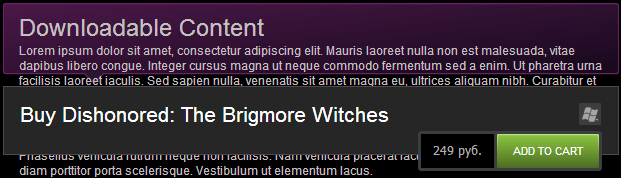
Problem Content obeys the design
Here’s the DLC info block in its current form:
What happens if the phrase is twice as big? What if the translated version is even longer? Here’s what:
DLC block is overflowed :-(
This block has fixed width and height (no idea why the width is even defined, since it’s same as parent’s) and a picture on the background. Even back in the days when there were no fancy CSS3 features you could make this block fluid. You would need a sprite and some hacks, but everything worked with hacks back then.
Solution Make design obey the content
Downloadable Content
Requires the base game Dishonored
on Steam in order to play.
All we need is one block and a bunch of styles:
<divclass="steam-demo game-dlc-notice"><h3>Downloadable Content</h3><pclass="small">
Requires the base game <ahref="#">Dishonored</a>
on Steam in order to play.
</p></div>
Old browsers won’t render the gradient and the rounded corners, not big deal.
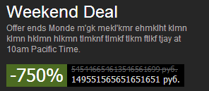
The problem with unflexible static markup is not limited to one block. Price blocks designed for dollar prices used to break in Russian shop. It’s not the case now, for the most part, but there is still quite a bunch of static unflexible blocks:
Steam won’t handle yet another ruble collapse :-)
There is a similar block in the neighborhood, which, surprisingly enough, is feeling great in unusual circumstances:
This leads us to another problem:
Problem Non-universal code
Two similar looking blocks are using completely different markup, although, in fact, they must be identical.
Solution Make the code universal
Let’s make a universal price block:
-1%£3.00£2.97
-33%$49.99$32.99
-600%100 000 рублей-500 000 рублей
-66%¥ 999¥ 333
Now it’s enough to vary the font size to make a block of an appropriate size. All the properties are set in relative em units. Price values are wrapped in additional span’s, so you can set a specific font size for them without affecting the properties of the parental element:
To adhere to the principle of the universal code, it is important to properly structure your styles and to understand what purpose each part of the styles serves. I brought myself to the following system:
Base styles – base font and colors; paragraph, headings & list styles, etc.
Utility classes – font size modifiers (a little bigger, a little smaller); info, warning and error colors; other universal utility stuff.
Layout – header, footer, sidebars, content blocks, other non-page-specific base blocks.
Grid. I don’t like restrictive grids. In this demo, I use a simple grid as a bunch of helper classes to avoid repeating the same bunch of styles over and over. I deviate from the grid all the time to write a bunch of custom classes for a specific block.
Modules – this are the guys I was talking about. Modules are repeating blocks, their base styles should not depend on the context (but can be modified by the styles of the context, see below). Modules can be nested.
Page styles – styles of the blocks specific to the page. This is the place where you can modify the styles of the modules located in a specific block on the page.
Problem “Obtrusive” javascript
Substitution of basic element behaviour with scripts and lack of proper fallbacks leads to a situation where tipical and habitual functions of HTML elements are completely lost.
For instance, Steam website contains all the classic mistakes collected in my post about proper link usage. Here’s, for example, “View all screenshots” link, which isn’t actually a link, since it doesn’t lead anywhere:
<divclass="apphub_Card interactable"style="float: left;width: 468px;height: 345px;"onclick="ShowModalContent('http://steamcommunity.com/app/205100/discussions/0/648813728349716360/?insideModal=1','Read at http://steamcommunity.com/app/205100/discussions/0/648813728349716360/','http://steamcommunity.com/app/205100/discussions/0/648813728349716360/');">
...
</div>
Not only these posts are opened in horrible modal popups (which are invented by the people who hate tabs), they also can’t be opened in a regular way, since they are not links. Not to mention the usage of inline styles and huge inline function calls, which are an example of poor code style.
Whole block containing community hub post can be made of an a element, popup (if you desperately want a popup) should only be opened if the block is clicked with left mouse button without any modifier keys.
Same is applicable to other UI elements: if the element leads somewhere, make a link. You can then apply any handler to it, just don’t prevent opening it in a new tab. If an element does some action within the page, use a button. More details and examples can be found in my post about proper links.
Besides all the above, “obtrusive” javascript directly leads to another problem:
Problem Low fault tolerance
What would happen if the CDN server serving js files goes down? If one of the scripts fails to execute correctly? That’s right, half of the functionality won’t work. It could’ve been working though, even if not as good as with the scripts.
Screenshot gallery becomes an empty rectangle without js, thumbs and scroll aren’t working either:
Solution Use proper fallbacks
Put the screenshots into a horizontally scrollable block, which will then become a normal gallery after the initialization. Since all the UI element are useless without javascript, hide them until the init.
To implement this approach it’s enough to give the gallary inactive class, which will be then changed to active upon initialization, and write a bunch of styles for both states:
Now you can view the screenshots even if the javascript is broken.
Same approach is applicable to “add to favourites” button, vote buttons, etc. – you can wrap them in a form and cath submit event with javascript handler. In case the javascript is not available or broken, the form will be sent to the server and the server can then redirect the user back to the page he came from.
Same with the blocks opening different popups – make ’em links, and they will thrive without javascript.
A few more things
Accessibility
Lots of the UI elements aren’t focusable, which means they can’t be Tab’bed on, and screenreaders, voice control thingies and other accessibility tools won’t know about them.
This is easily fixed by adding tabindex="0" to the UI elements and binding a common handler to clicks and Enter press.
Performance optimization
Currently, one page load on Steam website generates about 120 requests to the server (cache disabled), including 92 pics, 18 js and 8 css files. All the scripts are located in the head element, which significantly delays page rendering.
I concatenated all the scripts and styles, kept the styles in the header and moved the scripts down to the closing </html> tag (except for Modernizr, I kept it in the head since it affects the styles).
This significantly reduced the amount of requests to the server and the delay before the page starts to render. There are 25 requests in my demo, including 21 pics, 2 scripts and 1 style. The number of the resourses on a real production server may differ, but the difference in the amount of requests is obvious.
My design only uses two png sprites – one for standard screens and one for hign density (plus three fallback images to emulate gradients and translucency in older browsers). At first I used a single svg sprite, but, unfortunately, it significantly dropped the performance in some mobile browsers and also looked blurry in IE mobile. So, for now, it’s safer to use png sprites. Icon fonts are also acceptable, but they have a bunch of flaws, too.
UI and navigation
There are a lot of unclear and inconsistent moments in Steam’s navigation and the UI overall. A good UI designer could fix the situation. Unfortunately, I’m not one of them.
Conclusion
What has been done: responsive demo meeting the principles of progressive enhancement and unobtrusive javascript, with improved fault tolerance. Works in IE8+ and in almost every mobile browser.
What hasn’t been done: Steam’s header and footer, HTML5-video with a fallback to flash (for the game trailers), skipped a bunch of blocks present on the original page.
The warm-up is officially finished.
Bonus pack
Code of one of the items in the Steam’s main menu:


