Nintendo DSibrowser
| Screen resolution | 256 × 192, 2 screens |
| Viewport size | 240 × 176 |
| Browser | Opera (Presto) |
| User Agent | Opera/9.50 (Nintendo DSi; Opera/507; U; en-US) |
| Acid3 | 59/100 |
| HTML5 Test | 82/555 |
| CSS3 Test | Failed to run |
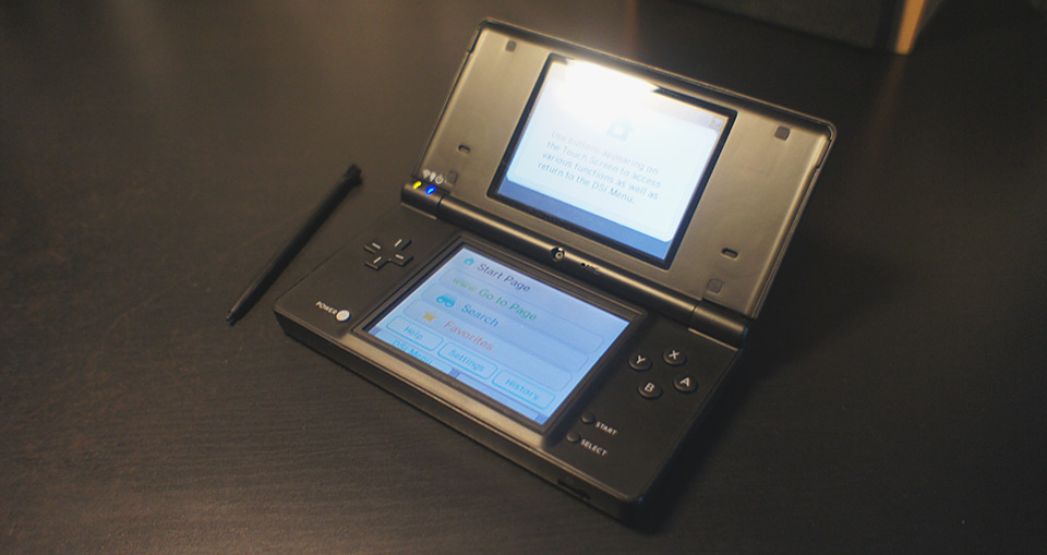
Nintendo DSi is a portable gaming console with two screens. Bottom screen is a resistive touchscreen, the top one isn’t. Console’s UI and touchscreen qualities assume that you use it with a stylus.
It’s pretty underpowered, with a 133 MHz processor and just 16 Mb of RAM. Internet connection is done via WiFi. Console’s browser is based on Opera (not Opera Mini, i. e. it doesn’t proxy its traffic through Opera’s serverside thingy).
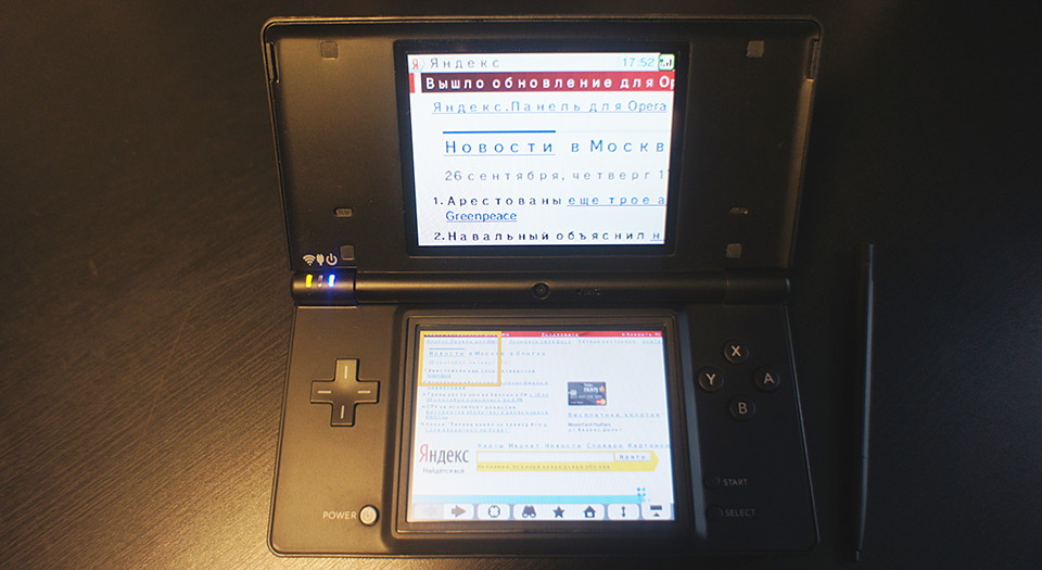
There are two ways the browser can display a page. The first is for regular, not mobile-optimized sites. One of the screens is used to display a whole zoomed-out page, the other shows a zoomed-in highlighted area:
You can swap the screen functions and drag the selection rectangle on the bottom screen:
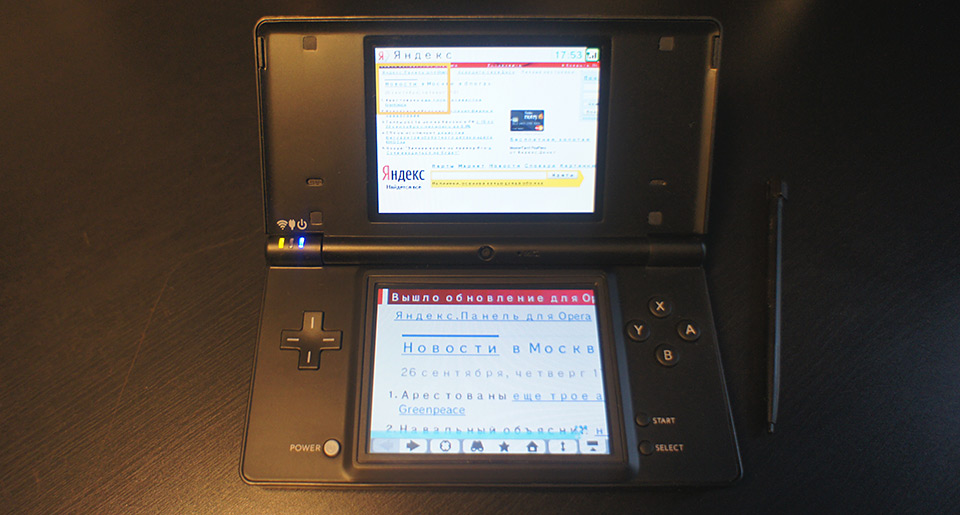
The second mode is for mobile-optimized websites. It uses the top screen as an extension of the bottom one. The page starts on the bottom screen, the top screen starts blank and fills up as you scroll:
Mobile-optimized mode is activated with an appropriate viewport meta-tag, e. g. <meta name="viewport" content="width=device-width">.
Features
Feature tests
Feature tests are done using Modernizr. Full table of my tests on google docs.
| Feature | Test | Actual result |
|---|---|---|
| backgroundsize | False | False |
| bgsizecover | False | False |
| borderradius | False | False |
| boxshadow | False | False |
| boxsizing | False | True |
| cssanimations | False | False |
| cssgradients | False | False |
| csstransforms | False | False |
| csstransforms3d | False | False |
| csstransitions | False | False |
| fontface | False | False |
| mediaqueries | True | True |
| opacity | True | True |
| rgba | False | False |
| textshadow | True | True (no blur) |
| touch | False | False |
| video | False | False |
As expected, the browser’s support for fancy new features isn’t huge: it supports Media queries, opacity, box-sizing and text-shadow without blur. Modernizr's box-sizing test returns a false negative result. Turns out, the browser understands the CSS-property, but doesn’t react in any way to the style.boxSizing javascript property (including the Opera-prefixed variant).
Fonts
The browser uses a single font for everything. It’s a sans-serif font, it has a couple of icons in its private use unicode area, which seem to be used somewhere in the console’s UI.
Moreover, the browser only uses three font sizes and transforms any other font size to one of those: small for 0px – 11px ComputedStyle size, medium for 12px – 14px and big for 15px and above.
Despite this font-size transformation, other metrics remain the same, e. g. a paragraph with margin: 0 0 1.5em 0 will have a margin calculated relatively to the specified font-size value, not the resulting one.
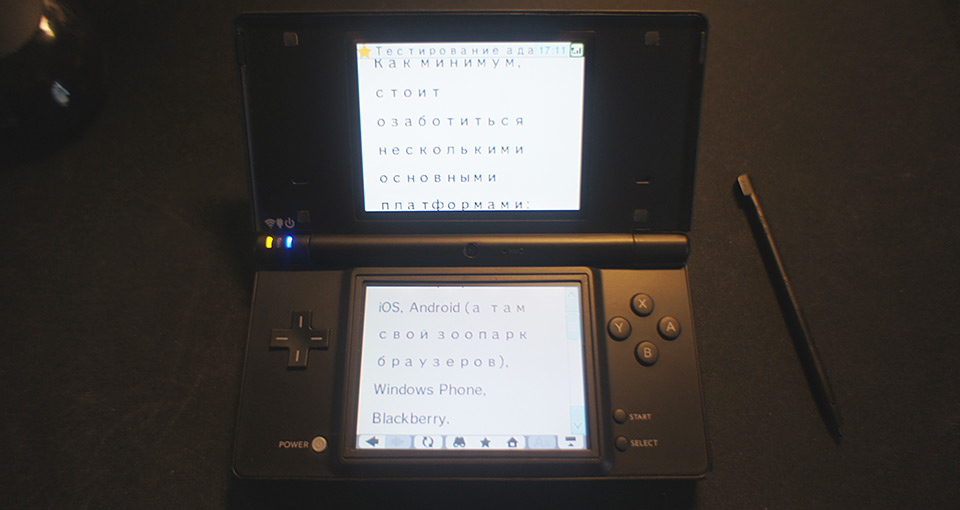
The font’s most annoying bug, though, is its weird letter-spacing for cyrillic characters:
Scrolling
Pages can be scrolled with the D-pad, using dragscroll or with a constantly visible scrollbar. Overflowed blocks also have a constantly visible scrollbar. Dragscroll doesn’t work for them.
Forms
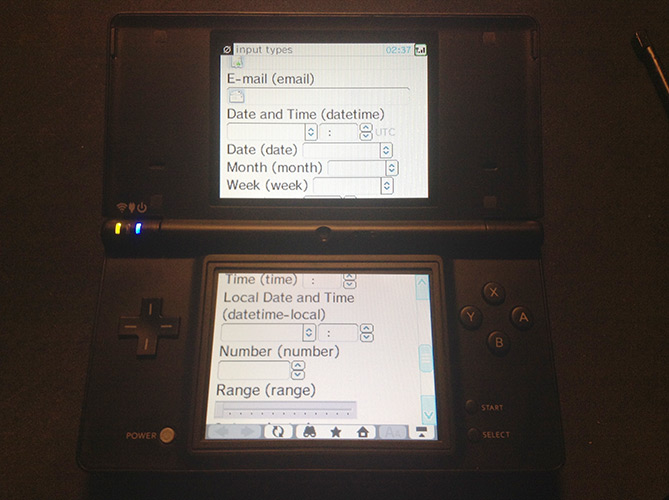
Surprisingly enough, the browser’s support for new input types is reasonable. It supports url, email, datetime, date, month, week, time, datetime-local, number and range:
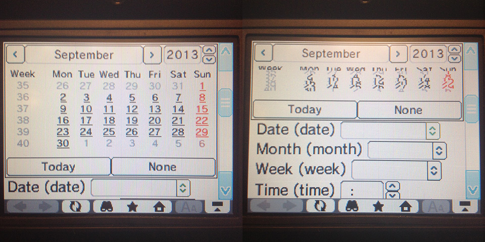
All the fields are validated according to their types when the form is submitted, pattern validation also works. Datepicker is buggy:
jQuery
jQuery doesn’t work starting from version 1.9.1 and above. No idea why.
Conclusion
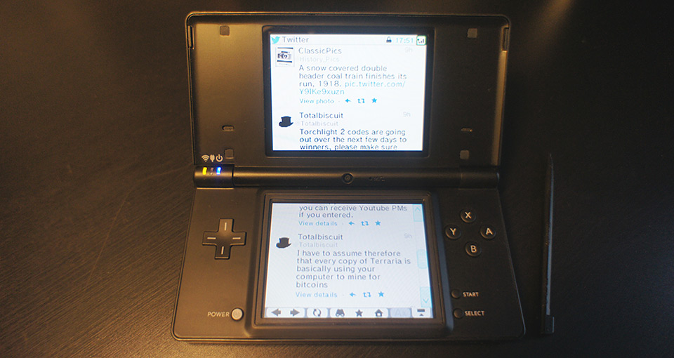
It’s totally possible to adapt a simple mobile website for this thingy pretty effortlessly. You just have to use proper fallbacks and consider the font problems. Twitter’s mobile site, for instance, is looking pretty good.
Related links
- Using the Nintendo DSi browser, Anna Debenham
- Nintendo DS & DSi Browser, Wikipedia
- Nintendo DSi at Game console browsers