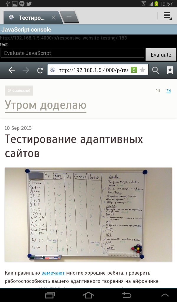
Testing responsive websites
As many good fellows have already noticed, it’s not enought to test your responsive creation on an iPhone. You should at least bother to check it on several major platforms: iOS, Android (which has a swarm of different browsers), Windows Phone, Blackberry.
If you are tough enough, all the above is your absolute minimum, which you happily extend with everything that comes to hand.
Briefly about desktop browsers
Windows
First things first, latest stable versions of Firefox, Chrome, Opera, IE, plus Opera 12 (on Presto), that’s all clear. After a year or so Presto engine will be gone for good :-(
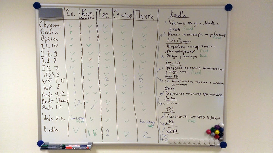
The main problem, as usual, comes with IE. IE users are distributed almost evenly between three version of the browser. You can’t install several version of IE on the same system, different "IE testers" are all crap. Even if they work, they still don’t show native XP font rendering and form elements.
The solution here is to have a bunch of virtual machines. Grab VirtualBox, clone two winXP machines, give ’em 196 Mb of RAM and install latest IE7 and IE8. It’s, actually, a good time to send IE7 to the dump, but I keep it for rare ocasions, since some of my scripts support it and I need to test new builds once in a while.
Clone another two machines running Win 7 (give ’em 512 Mb of RAM) and install IE9 and IE10. All this stuff works simultaneously pretty effortlessly:
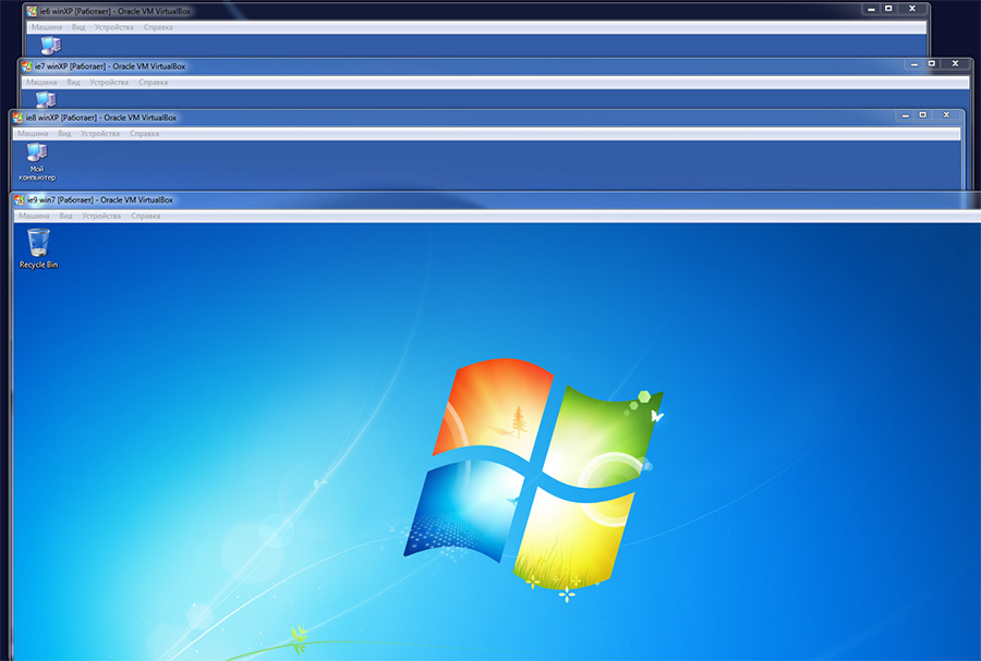
I still hope IE’s autoupdate (it was introduced in IE10) will make the difference some day and we won’t need to keep all this VMs. It’s not the case as of now.
Linux & Mac
It’s also worth having a VM with some linux distributive and, if possible, a Mac would also be good. Same browsers have significant differences when it comes to rendering system specific stuff, such as fonts, form elements and cursors.
Mobile devices
The main rule here: if it’s possible to test on a real device – test on a device. Here’s a couple of reasons:
- You can’t touch the emulator. Text size, size of the UI elements, touch responsiveness, etc. – all of these things can be adequately tested only on a real device.
- Emulator’s performance often differs from the performance of a real device. You won’t see the lags and memory overflows, animation speed and script performance will differ.
- Lots of buggy and inconvenient emulators.
- Lack of emulators for rare devices.
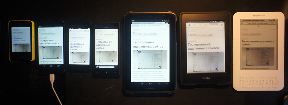
My initial idea to buy a device working on each of the popular operating systems (iOS, Android, Windows Phone) realized and turned into gathering of rare devices with browser on board.
My collection now contains Kindle Keyboard and Kindle Paperwhite with their grayscale webkits, Nokia Asha 501 (a phone on modified S40 with horrible Ovi browser and not so horrible Opera Mini working on Java), Nintendo DSi bought after reading this article, Nintendo 3DS, PS Vita and lots of other rare and not so rare stuff.
It’s important to note, though, that any large project can’t be properly tested on all of them. The main goal here is not to support each and every device, but to properly optimize the site, make it adaptive in a flexible way. The site shouldn’t necessarily work equally on each device, but it’s important to ensure the availability of content and get rid of the nastiest bugs, possibly avoiding UA sniffing (although it’s hard at times).
The possibility to touch and test your project on different devices gives valuable information on the adequacy of the UI, availability of necessary fallbacks, typical bugs encountered on different devices, etc. All this allows you to create good universal development patterns and apply them in the future, reducing the need for testing to a minimum.
Where to test
Mandatory:
- iOS — Safari and Opera Mini
- Android — default browser on 2.x and 4.x, Chrome, Firefox, Opera Classic, Opera, Opera Mini
- Windows Phone 8
- Blackberry 10
Bonus pack in order of subjective importance:
- Opera Mini Java app
- Windows Phone 7.8
- Older versions of iOS
- Older versions of Blackberry
- Default browser on Android 3.x
- Nokia Browser
For fun:
- Kindle Keyboard, Touch & Paperwhite
- Sony PSP, PS Vita
- Nintendo DSi, 3DS
- Ovi browser (Nokia Xpress)
- Steam Big Picture browser
- Smart TVs, refrigerators, any other hardware and emulators you can get your hand on
Where to get the emulators
- Android — download SDK, unzip, launch SDK Manager, install required Android versions, go to Tools > Manage AVDs, create a device, launch it, profit.
- Windows Phone 8
- Windows Phone 7.1 + 7.8 update
- Blackberry (requires VMware Player)
- Opera Mobile Classic
- Opera Mini Simulator — Java-applet. Similar to Symbian Java app. Its rendering is slightly different compared to iOS and Anroid versions.
- Nokia Asha with Ovi browser.
- Nokia Symbian emulators (Symbian Belle with Nokia Browser is particulary interesting)
- Nokia remote device access via the Java application. Requires an account. It’s pretty laggy, but it’s enough to check out the phone and it’s browser.
- Firefox OS Simulator in the form of a Firefox plugin.
Debugging on mobile devices
Android
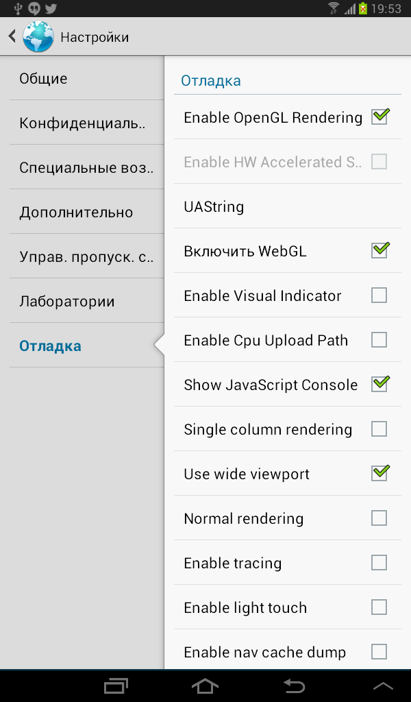
In the stock browser, type about:debug in the adress bar. This will lead to a new debug section appearing in the browser’s settings with a bunch of dev options in it, including concole.
In Android Chrome, you can use remote debugging:
- Install the ADB plugin for desktop Chrome
- Enable USB debugging in device’s settings
- Connect the device via USB
- Profit
Now you have full webkit devtools at your disposal. All the interactions are displayed on the device in real-time:
iOS
If you happen to have a Mac, you can debug an iOS device remotely via Safari’s web inspector:
- Go to device’s settings > Safari > Advanced, turn on the Web Inspector
- Connect the device to your Mac
- Go to Develop menu in your Mac’s Safari. You shoud see your device with a list of opened pages.
Just like on Android, full devtools are available.
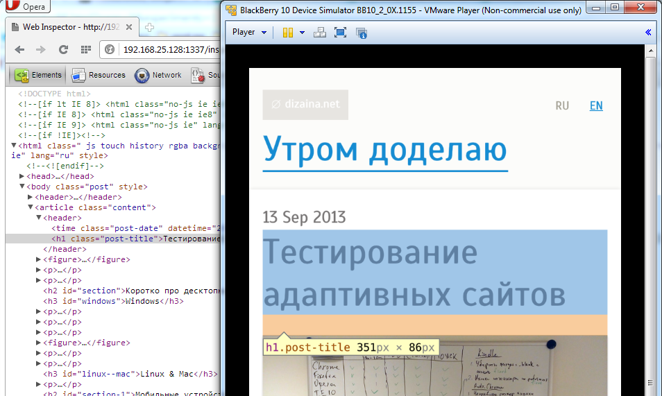
Blackberry
Blackberry has remote debugging via web-based webkit devtools:
- Connect the device via USB or connect it to your computer’s network via WiFi.
- Turn on the web inspector in the device’s browser setting. You’ll also see the IP adress and port there. If you’re using the emulator, the IP adress won’t appear, but you can look for it in the emulator controller, in the bottom of the window (the controller comes with the emulator as a separate program). Port in this case will be 1337.
- Go to
IP:Portfrom a desktop browser. You should recieve a page with webkit devtools.
Web-based webkit devtools work properly only in webkit-based browsers.
Jsconsole.com
Great tool allowing you to remotely debug almost any device. All you need to do is to inject a script containing a unique ID (preferably before the rest of the scripts, so you won’t miss any logs and errors), and you got yourself a console with error output and remote command execution. Don’t forget to remove the script from production!
Read detailed official docs.
Your own console
If using jsconsole is inconvenient for some reason, you can always write your own console. Just redefine console.log, console.warn, console.error, window.onerror and something else to your taste. You’ll get a fairly simple tool which is sufficient in most cases.
Here’s a simple example:
var customConsole = {
    log: function(message) {
        this.add(message, 'info');
    },
    warn: function(message) {
        this.add(message, 'warning');
    },
    error: function(message, source, file) {
        this.add([message, source, file].join('<br>'), 'error');
    },
    add: function(message, type) {
        if (typeof message !== 'string') message = '<i>' + message + '</i>';
        document.getElementById('console').innerHTML += (
            '<p class=' + type + '>' + message + '</p>'
        );
    }
}

if (dev_console) {
    window.console = customConsole;
    window.onerror = function(message, source, file) {
        console.error(message, source, file);
    };
}
Modify it to your own taste and needs.
Testing a website running on a local web server on mobile devices
The easiest way is to connect everithing to the same WiFi router. You should also set fixed IP adress for your computer, since it have a tendency to change unexpectadly and make all of your mobile bookmarks useless. Then use this very IP in your webserver’s config, e. g. enginx:
server {
    ...

    listen   192.168.1.5:4000;
    listen   127.0.0.1:4000;

    ...
}
That’s it, check out the site from your mobile devices.
If the web server is running on a virtual machine, make a bridge connection (in the VM’s settings). VM will get an IP in the routers subnet, use it to access the site both from mobile devices and from the host OS.
Testing in proxy browsers
That is Opera Mini. And Ovi, if you are desperate enough.
The problem with proxy browser is that you can’t test your site on a local server, since it should be visible on the internet.
My approach here is to create a test subdomain with http authentication on the hosting server and pull current version of the site using git once in a while. The site will be accessible by proxy browsers and remain password protected at the same time. An example config for http authentication (for Apache this time):
<VirtualHost *:80>
    ...

    <Location />
        Deny from all
        Allow from #YOUR IP HERE
        AuthUserFile /etc/apache2/users
        AuthName testdomain
        AuthType Basic
        Satisfy Any
        require valid-user
    </Location>

    ...
</VirtualHost>
You can put your IP after Allow from to simplify the access to the domain from regular browsers.
You can read apache docs on adding user/password pairs to the http auth. Long story short, htpasswd -cm /etc/apache2/users username will ask you for the password, then create a file at the specified path and add a user username with MD5-encrypted password. Be careful, as the -c flag rewrites the existing file.
TL;DR
Test your sites on a maximum number of available devices and emulators. Use new HTML5 features and specific device capabilities, but don’t forget about proper fallbacks and broad content availability.
Related links
- The iPhone obsession, Peter-Paul Koch
- Support Vs Optimization, Brad Frost
- Unobtrusive JavaScript, Wikipedia
- Progressive enhancement, Wikipedia